LOGO
- Adaptable for digital communication
- Striking contrast for use as an icon
- Icon-compatible design
- Unique, customized, and no standard font
- Technically compatible with any platform
BRAND IDENTITY, WHY?
In the competitive landscape of today's digital market, establishing a distinctive and consistent brand identity is paramount. This identity, rooted in visual and tonal coherence, serves a crucial purpose — to effectively communicate your essence, evoke a specific feeling, and most importantly, leave a lasting impression in the minds of your audience.
Amid the saturation of the electronic market, where standing out is essential, a brand must navigate numerous parameters to connect with its target audience. Uniqueness is key.
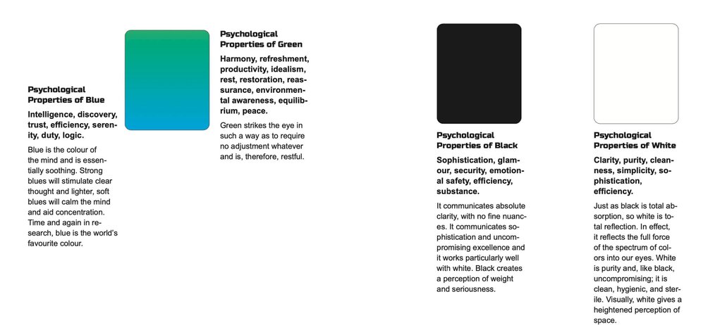
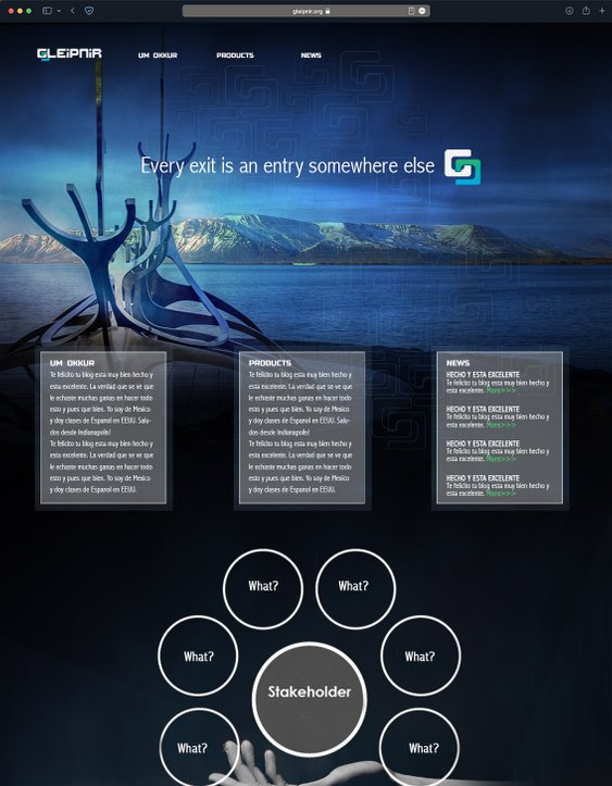
Below is a compelling example highlighting the essential elements of building a robust brand identity. From conceptual illustration and distinguished design to the flexibility of the design itself, color scheme theory, choice of typeface, and the product presentation — each element contributes to crafting a memorable brand presence.
I had the privilege of executing this approach in 2021 as part of an educational video game and funding project, demonstrating the transformative power of a well-crafted brand identity.
While a complete logo may not always function optimally on social media platforms, particularly on mobile devices, our icon is purposefully designed and optimized to meet these specific circumstances. It ensures maximum contrast against surrounding content, making it visually impactful and easily recognizable


